Now that you’ve added GA data to your Microsoft Dynamics CRM, you probably want to display it in a meaningful way. You probably want to see reports that will allow you to see things like the number Deals that came from a specific traffic source.
In this article, we’ll go through the process of creating such a report.
Note: For this particular report we have used Lead Object, but you can create the same report for other objects as well.
First, go to Microsoft Dynamics CRM – Advanced Settings – Customization
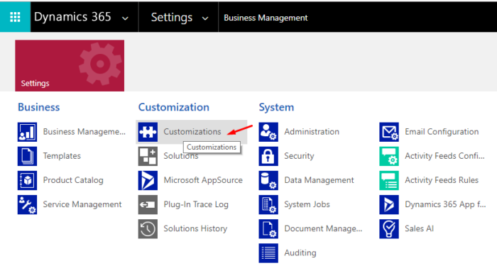
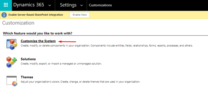
Then click on “Customize the System”
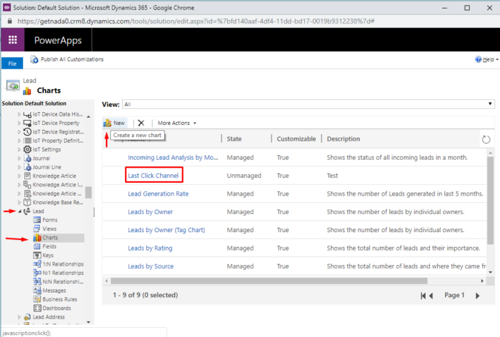
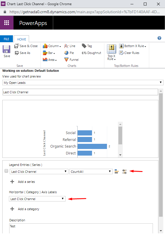
Find Entities > Lead > Charts, then click “New”
A new window will pop up. Fill the fields like in the image below and then click Save and publish the changes:
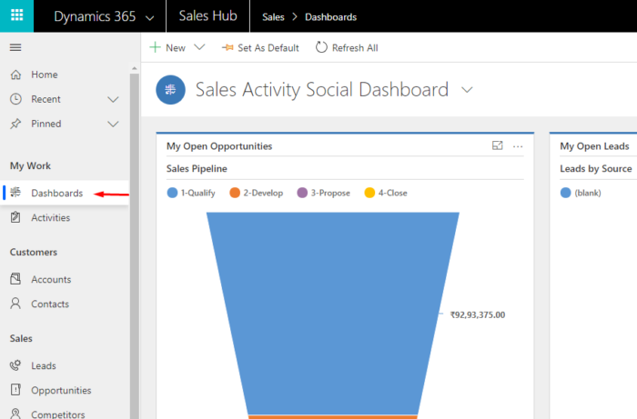
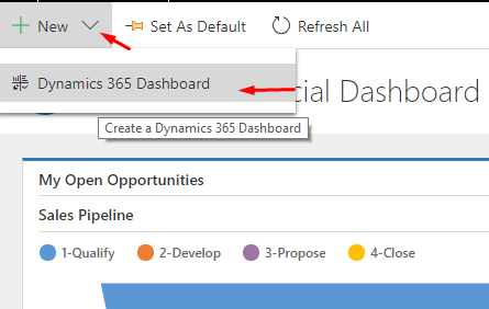
Then get back to the main tab and Click Dashboards > New > Dynamics 365 Dashboard
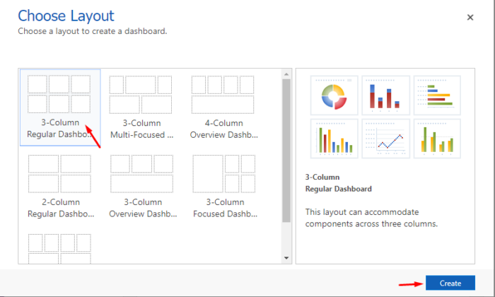
Choose the Layout and then click on “Create”. You can choose anything you like.
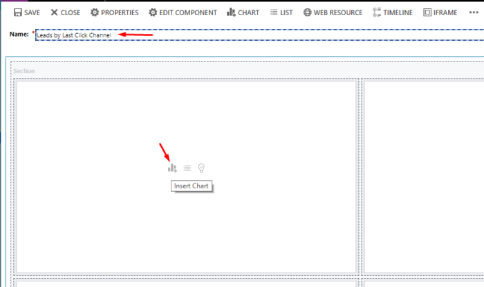
Fill out the Name, then click the Chart Icon:
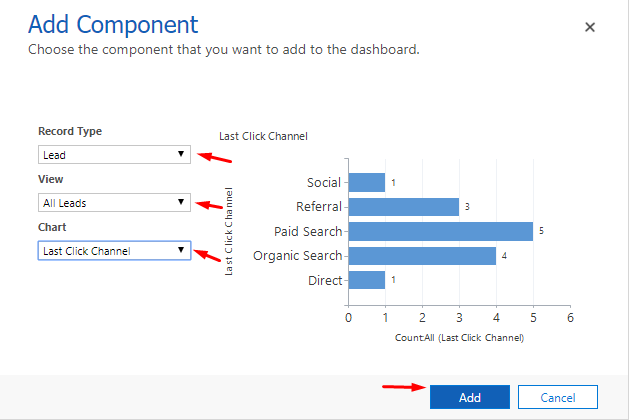
Fill out the fields as shown in the image below. You should select the Chart that you have created previously. Finally, click Add and Save.
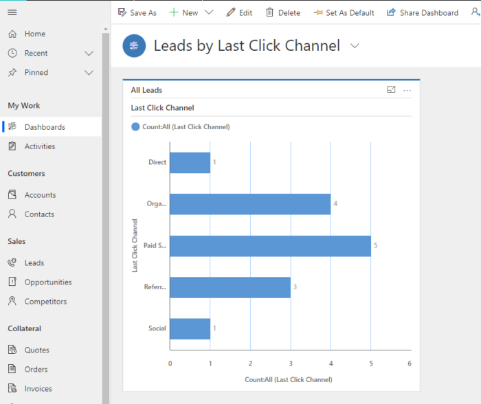
Here is how the result would look like